PORTFOLIO
Vivint REBRAND
PORTFOLIO
Vivint REBRAND
PORTFOLIO
Vivint REBRAND
Vivint REBRAND
Vivint
rebrand*

Reimagining one of Utah's most recognizable brands during a global reset
Introduction
What if we rebranded Vivint?
That question started to surface during the thick of the COVID pandemic - a time when we were all stuck at home, looking at everything under a microscope. At first, the idea felt impossible. Vivint had built a billion-dollar brand tied to its bright orange identity. But the more we sat with it, the more it made sense. We were evolving fast, and the brand needed to keep up.


Before
After
Before
After
Before
After
Before
After
Primary Logo
Rebrand Launch Video
Rebrand Launch Video
Rebrand Launch Video
Rebrand Launch Video


My Role
At the time, I was on Vivint’s in-house creative team as Sr. Content Manager – Graphic Designer & Photographer, reporting to Damon Price and Kevin Swiss. I wore a lot of hats: designing full-time, leading photo shoots, running our social channels, and helping plan major company events - always with a focus on the rep experience.
I didn’t just post content. I created it - design, photography, copy, and rollout strategy - keeping everything fresh and consistent across every platform. At the same time, I was deep in the design trenches, building internal assets, marketing materials, and providing creative direction for company-wide initiatives.
When we started talking rebrand, I was all in from the beginning. I was part of the small core team that studied every curve, color, and component of the new visual system. This was the kind of work I thrive on - building something from the ground up, shaping how people feel when they see it, and making sure it works in every environment.


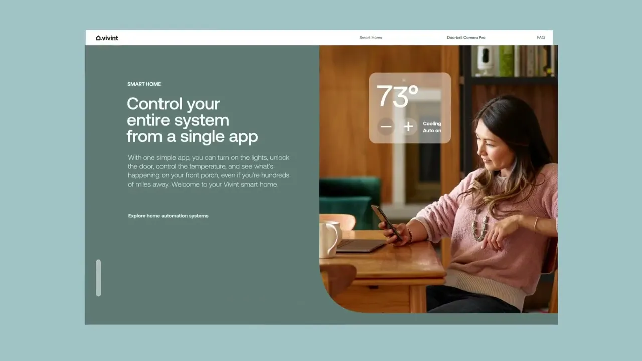
Strategy and Concept
As the business evolved and expanded, our identity needed to do the same. The brand had to be scalable, modern, and flexible across physical products, vehicles, web, signage, packaging, and video.
One of the biggest strategic decisions was to drop the words “Smart Home” from the name. We believed the Vivint name had built enough awareness to stand on its own. Removing those two words shortened the wordmark significantly and gave us much more flexibility in design across all mediums.
The tagline also shifted to something that better captured what we wanted people to feel: Peace of Mind.
Logo Animation: Before & After
Logo Animation: Before & After
Logo Animation: Before & After
Logo Animation: Before & After
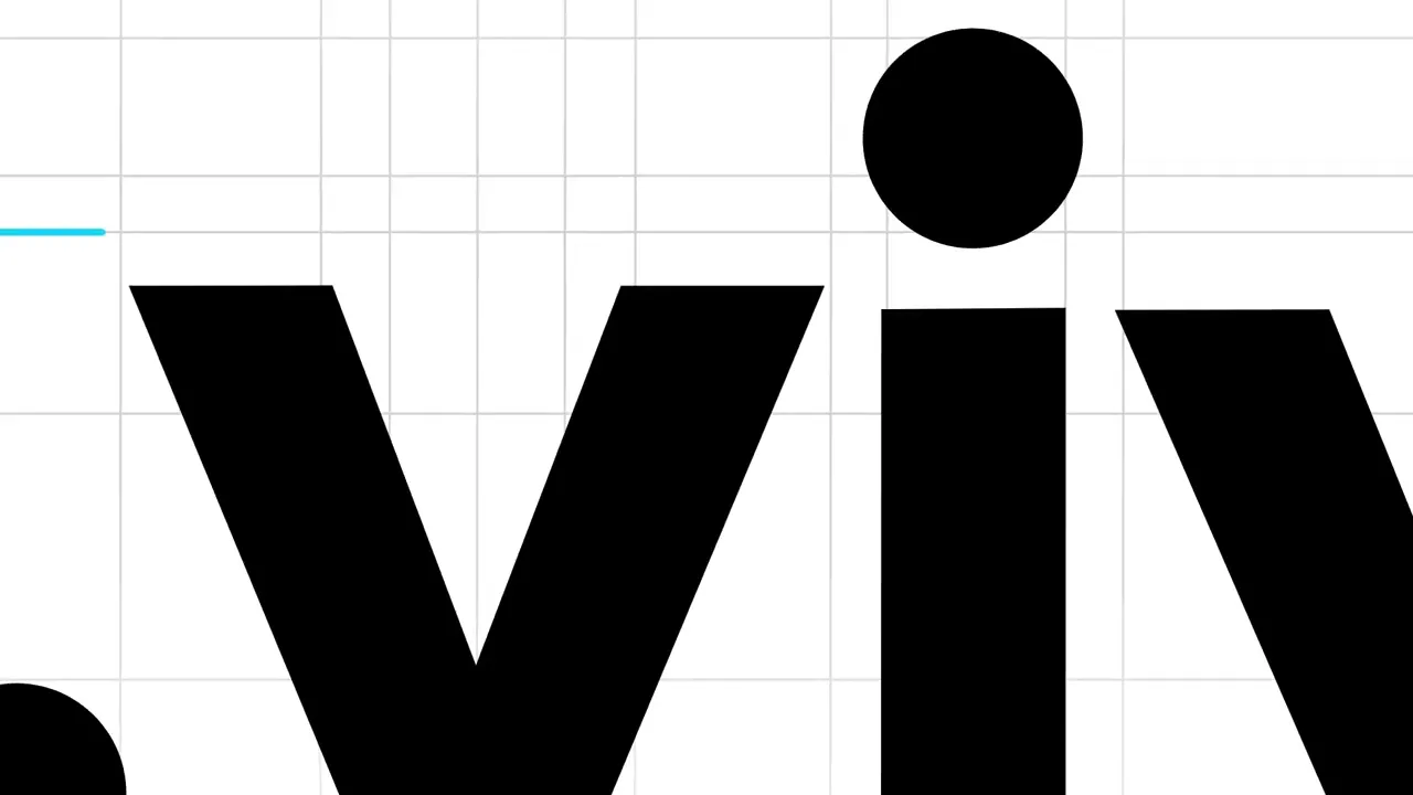
Design and Refinement Process
We approached the rebrand like we were studying for finals. Every letter. Every color. Every pixel. We tested uppercase, lowercase, period or no period. We explored dozens of icon concepts before landing on the one that made the most sense.
Vivint had never had a true logo mark or icon. It relied solely on the wordmark - simple lowercase type with a period. One of the most meaningful additions was a clean, modern house icon. We explored outlined and filled versions, experimenting with different roof pitches and proportions. We also moved the period from the end of the wordmark to sit next to the house icon, making it part of a cohesive new lockup.
We refined every letter in the wordmark, with the biggest change made to the letter “t.” We adjusted the height, crossbar, and curvature to make it feel more intentional, confident, and modern.


Color System Redesign
Vivint had owned bright orange for two decades. It was everywhere - trucks, signs, packaging, the arena. But it had started to feel overwhelming and restrictive. We built a new color palette based on elevated tones found in homes: soft neutrals, warm earth tones, and shades that felt calm, premium, and intentional.
The new palette gave us much more range and allowed for thoughtful combinations in design, video, web, and packaging. We also created a muted black color with a touch of green tint, which became our new primary brand color.
We tested various combinations extensively, including placing new yard signs in each color on actual lawns to observe how they interacted with real-world architecture and surroundings.

Brand Photography Guidelines
To support the rebrand across all channels, I developed Vivint’s first official Photography Guidelines. This became a cornerstone for internal and external creative teams.
The guide included:
• Framing and angle preferences
• Emotional tone and casting
• Studio and lifestyle approaches
• Color, lighting, and composition
“Vivint photos should feel like a calm exhale, not a loud pitch.”
The goal was to build a library of content that supported the new premium and human tone of the brand.
National Campaign with Snoop Dogg
To make a splash, Vivint launched a national ad campaign featuring Snoop Dogg and viral TikTok creator @doggface208(Nathan Apodaca). It was one of the biggest creative moments in the brand’s history.
The one-day shoot included:
4 commercial spots
VO session with Snoop Dogg
Still photography for use across digital and print
It marked the public debut of the new branding and delivered on our brand promise in a bold, unexpected way.


Vivint Arena Signage and Brand Placement
As part of the rollout, we worked with internal teams to finalize the logo lockup for Vivint Arena, home of the Utah Jazz. I was part of the group reviewing and delivering creative direction for the new arena signage - including the new logo on the court itself. Seeing that identity installed on a national stage was a huge milestone.


My Contributions
• Designed and authored the official Photography Guidelines
• Helped design the new Brand Guidelines and visual identity
• Led the social media transition and rebrand announcement
• Contributed to the new color palette and supporting design system
• Helped develop and refine the house icon and period placement
• Refined the wordmark, including the custom “t”
• Styled props and visuals for the launch brand shoot
• Worked on internal and external materials implementing the new brand
• Contributed to the Vivint Arena logo lockup and signage planning
This project was one of the most collaborative, rewarding, and high-impact efforts I’ve ever been part of. We didn’t just rebrand a company. We reimagined a brand that millions already knew - and gave them a reason to see it in a new way.


Creative Director. Brand Builder. Detail Obsessed.
I design brands, campaigns, and experiences that connect – from solar and smart home to lifestyle apparel and large-scale events. I lead with vision, build the systems, and deliver work that moves people.
01
02
03
Creative Director. Brand Builder. Detail Obsessed.
I design brands, campaigns, and experiences that connect – from solar and smart home to lifestyle apparel and large-scale events. I lead with vision, build the systems, and deliver work that moves people.
01
02
03
Creative Director. Brand Builder. Detail Obsessed.
I design brands, campaigns, and experiences that connect – from solar and smart home to lifestyle apparel and large-scale events. I lead with vision, build the systems, and deliver work that moves people.
01
02
03
Creative Director. Brand Builder. Detail Obsessed.
I design brands, campaigns, and experiences that connect – from solar and smart home to lifestyle apparel and large-scale events. I lead with vision, build the systems, and deliver work that moves people.